This project has presented a challenge for me in regard to knowledge of how to use Maya and what my limitations with what can be achieved. I felt this fact has guided my work from the beginning and led to my concept art being ridgid. I also think my other error was instead of trying to engage in Issey Miyake other designs and breakthroughs in fashion. I feel very strongly that it I were to redo this project it would be radically different, there would be little in a blocky, straight lined way and none curves.
I felt I did well at getting my ideas out quickly onto paper which felt natural thanks to Invisible Cities. This really helped me to realise the travelogue after looking into Miyakes influence. I looked into ecological structures and futuristic structures and concept art to help me realise this city.
In the OGR2 I was told my city was very dystopian, which I would agree with because it was dark and the scene itself gave out sharp edges and had a harsh, dangerous nature intrinsic in its design. This was the problem which I encountered when I tried to recreate it in Maya, a fact I couldn't move away from.
I'm future I need to really step back, and look at all of what my designer is in their work and what they as a designer looks to achieve in their work. I also need to make sure I work this out before I commit because otherwise it's almost impossible keep to backtrack and start again after this point.

Friday, 15 December 2017
Wednesday, 13 December 2017
Tuesday, 12 December 2017
What If? Metropolis - Current Progress
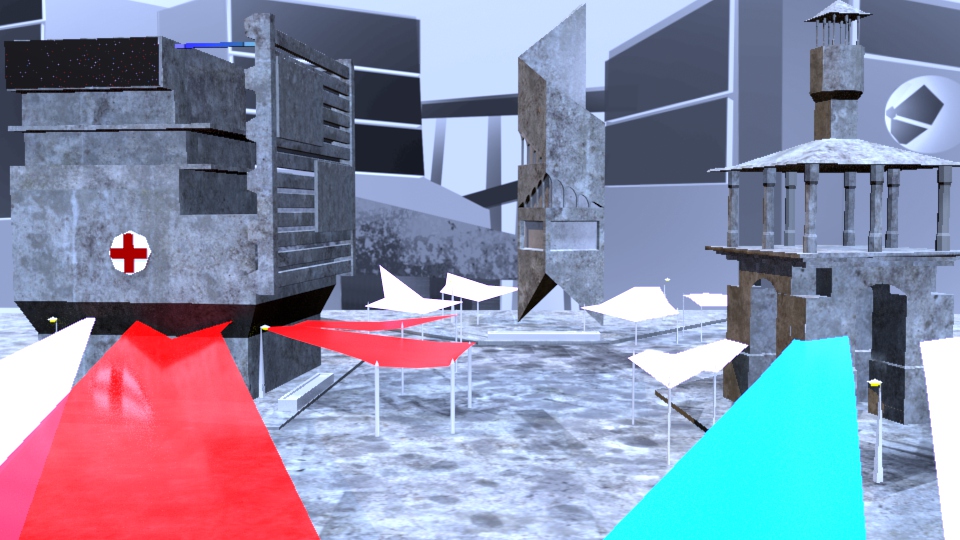
I've textured most of the objects in my set and have been fiddling around with the lighting, my next task is to work out how to make the scene look warmer and more Utopian.
Friday, 8 December 2017
Adobe Animate - Jump Cycles
We did two jumps which were recorded on film then these are the preliminary drawings which will help me to complete my animation, I tidied them up and resized them in Photoshop to give myself a smoother time animating.


Wednesday, 6 December 2017


Tuesday, 5 December 2017
Film Review - Suspiria (1977)

(Figure 1 - Susperia - [film])
Suspiria (1977) is a cinematic overload, Dario Argento created a film which utilized many different elements of film making to conjure an experience utterly terrifying, even more so with time, where goofy special effects and badly dubbed voice overs add to the cacophony of madness presented to us. The film itself is of a surreal nature, dreamlike, the only real place in the entire film is the Airport which Suzy (Jessica Harper) first acquaints the audience, you can see with editing the length of time drawn out, and the emphasis created on the sliding doors mechanism 'Open' and 'Closed' signifying the transition into the 'dreamscape' "This simple door is a portal. Once Suzy walks through it, she has entered a dreamscape." (Hall, 2016)

(Figure 2 - Susperia - [film])
"He uses bright primary colors and stark lines to create a campy, surreal atmosphere, and his distorted camera angles and crazy lighting turn out to be much more memorable than the carnage." (Maslin, 1977) Without the strong use of primary colour in the film it would be come dull and nowhere near as interesting. The use of sound ties it all together by an experimental German metal band, The Goblins. It creates an environment for the Audience which is completely Isolating and smothering, the soundtrack for this film creates an audacious atmosphere which keeps you continuously on the edge of suspense and uneasiness.

(Figure 3 - Susperia - [film])
It is clear early on in the film that Dario Argento uses themes of German Expressionism in his harsh contrasts of colour and Mise en Scene. He uses colour as a symbolism as much as a technical element. It is noted early on that red means danger, and the film is practically completely red. The building is bright red, the hallways are bright red, the lights are bright red, the blood is so red it looks like Tabasco Sauce. Lights are thrown around the environment without regard for structure creating a space (more often than not) bathed in shadows, corners and undefined edges further adding to the disorientation of the Audience and the Surreal nature of the Environment, complete and utter saturation of some scenes forces a mood on the characters which further heightens the Madness and Horror in the subtlest of ways. "Argento’s deliriously artificial horror film owes as much to Georges Méliès and German Expressionism (specifically The Cabinet of Dr. Caligari) as it does to Jean Cocteau and Grimm fairy tales." (Gonzalez, 2001)
Bibliography:
Gonzalez, E. (2001). Suspiria | Film Review | Slant Magazine. [online] Slant Magazine. Available at: https://www.slantmagazine.com/film/review/suspiria [Accessed 5 Dec. 2017].
Hall, J. (2016). Suspiria Review: A Bad Dream Made Real. [online] Slashfilm. Available at: http://www.slashfilm.com/suspiria-review/ [Accessed 5 Dec. 2017].
Maslin, J. (1977). Movie Review - - 'Suspiria,' a Specialty Movie, Drips With Gore - NYTimes.com. [online] Nytimes.com. Available at: http://www.nytimes.com/movie/review?res=990CEFDB1F3BE334BC4B52DFBE66838C669EDE? [Accessed 5 Dec. 2017].
Illustrations:
Figure 1 - Suspiria. (1977). [film] Directed by D. Argento. Italy: Studio Mafera.
Figure 2 - Suspiria. (1977). [film] Directed by D. Argento. Italy: Studio Mafera.
Figure 3 - Suspiria. (1977). [film] Directed by D. Argento. Italy: Studio Mafera.
Friday, 1 December 2017


Adobe Animate - Run Cycle
A run cycle at 24 fps, each step is a cycle of 12 fps with ground contact at every 7th frame.


Film Review - The Shining (1980)
Stanley Kubicks' film The Shining is the product of a genius bored with the mainstream of genre and looking to make a film that was more of a statement of art, horror and the people who make and watch horror. Stanley Kubrick had an IQ of 200, an incredibly
smart man, everything you see in his films is meticulously thought over and
precise, there are no mistakes in his work, everything is deliberate.

(Figure 1 – The Shining – Movie still – Typewriter, white)
One of the subconscious themes Kubrick uses in symbolism in this film is the suggestion of the Nazi Holocaust, and the Third Reich. Symbolism of the Holocaust occurs when Jack is
writing his novel in the Colorado lounge, the typewriter he is using is an
‘Adler’, this is a German brand, the word ‘Adler’ means Eagle in German; the
eagle was heavily associated with the German Nazi Party and is featured in
abundance throughout the film in the scenery of the Overlook Hotel. The
typewriter changes halfway through the scene from white, to blue. “Kubrick also links
the colors blue and yellow in a vision of Danny’s that has a compelling
historical resonance. While Kubrick uses blue in The Shining in its traditional
associations with the ethereal, the transcendent, ghosts, and death, we should
not overlook its use as the color here of cold, natural, emotional, and
hierarchical power as well.”. (Cocks, 2010)

(Figure 2 - The shining - Movie Still - Ullmans Office)
Another thing Kubrick does is more deliberate to the viewer and it complements the film design. Kubrick deliberately creates a set of surrealist quality by creating a building layout which doesn't physically work, for example during the scene where Jack Torrence (Jack Nicholson) meets the owner of the Overlook Hotel for an interview in his office, there is a window in the background. The window fits in an impossible space as there is a corridor on the other side of the wall. "My interpretation of this set design anomaly, as presented in the previous version of this analysis, was that Kubrick was deliberately disorientating the viewer." (Ager, 2008) It is Arguable that the subliminal disorientation during the film in such a subtle way makes this space and many others through the film e.g. the maze, the Colorado Lounge, the Gold room, Room 237 and the Torrence Bedroom feel unnatural and unsafe for the viewer despite the use of symmetry in the majority of his scenery.

(Figure 3)
Its very interesting that the set seems to have an impersonal and disregarding view of humans, almost like it has a personality itself. It is arguable that the set begins to effect the character of Jack and drives him to madness in a cycle like the previous caretaker of the hotel. Its a good example of the exterior set affecting the characters in a way which is totally overpowering and dominating. "we also begin to get ample indication that he will follow in the footsteps of the previous caretaker, Grady, a steady-seeming fellow who chopped up his wife and daughters one winter’s day and then blew his brains out." (Jameson, 2017)
Bibliography:
Cocks, G. (2010). A Quality of Obsession Considerably Further
East: The Holocaust in the Cinema of Stanley Kubrick: An Interdisciplinary
Journal of Jewish Studies
Ager, R. (2008). THE SHINING (1979) analysis by Rob Ager. [online] Collativelearning.com. Available at: http://www.collativelearning.com/the%20shining%20-%20chap%204.html [Accessed 1 Dec. 2017].
Jameson, R. (2017). Kubrick’s Shining - Film Comment. [online] Film Comment. Available at: https://www.filmcomment.com/article/stanley-kubrick-the-shining/ [Accessed 1 Dec. 2017].
Illustration:
Figure 1 - The Shining (1980). [Film] Stanley Kubrick,
Elstree Studios: Warner Bros and Hawk Films.
Figure 2 - The Shining (1980). [Film] Stanley Kubrick,
Elstree Studios: Warner Bros and Hawk Films.
Figure 3 - Floor Plan.The Stanley Kubrick Archives. [Book] Alison Castle: Taschen
Film Review - Repulsion (1965)

(Figure 1)
"Carol is not simply a Hitchcockian aberration of what lies beneath the “perfect woman,” she is the reflection of what lies beneath repressed desire — in men and women." (Morgan, 2011)

(Figure 2)

(Figure 3)

(Figure 4)
The representation of desire in Repulsion is reflected heavily in regards to the males who frequent the film, there is a level of repressed desire in every interaction Carol has with the male characters, it is an over the top and surreal experience from the first interaction with the the Road worker who 'cat calls' Carol as she walks past to the interaction between her at the end of the film with the Landlord, who exhibits traits reminiscent of a predator grooming her with niceties before forcing himself on her. They represent an uncontrollable and dangerous state which we as the viewer feel continuously uneasy about. "The men she meets are far from sympathetically portrayed, and we are led to understand her fear and revulsion by the surreal expressionism used to portray her mental state." (Anon, 2016)
Bibliography:
Anon, G. (2016). Repulsion. [online] Time Out London. Available at: https://www.timeout.com/london/film/repulsion [Accessed 1 Dec. 2017].
Gonzalez, E. (2006). Repulsion | Film Review | Slant Magazine. [online] Slant Magazine. Available at: https://www.slantmagazine.com/film/review/repulsion [Accessed 1 Dec. 2017].
Morgan, K. (2011). Roman Polanski Understands Women: Repulsion. [online] HuffPost. Available at: https://www.huffingtonpost.com/kim-morgan/roman-polanski-understand_b_301292.html [Accessed 1 Dec. 2017].
Illustrations:
Figure 1 - Repulsion. (1965). [film] Directed by R. Polanski: Compton Films: Tekli British Productions
Figure 2 - Repulsion. (1965). [film] Directed by R. Polanski: Compton Films: Tekli British Productions
Figure 3 - Repulsion. (1965). [film] Directed by R. Polanski: Compton Films: Tekli British Productions
Figure 4 - Repulsion. (1965). [film] Directed by R. Polanski: Compton Films: Tekli British Productions
Subscribe to:
Posts (Atom)
-
 This post contains my research notes and drawings from the third city depicted by Italo Calvino, the city of Diomira. I've noticed a d...
 -
 (Figure 1) Black Narcissus is a film with contains the three struggles which make good drama. Man against the world, Man against Man ...
